![]() How do you create and present the encounter maps in your games? Do you ever struggle with figuring out the most efficient option?
How do you create and present the encounter maps in your games? Do you ever struggle with figuring out the most efficient option?
After finally getting a better handle on visually tracking combat conditions with markers and cards, mapping is a similar visual aid I really struggle with in 4e, as much as there are tons of mapping options we have today between tiles, poster-style battle mats, and erasable battle mats, never mind 3D terrain and digital options.
The ultimate question: Which physical mapping method saves the most time and communicates the most information quickly and evocatively while reasonably affordable? 
We’ll save a look at digital mapping tools and software for another time, as those come with special considerations of access and execution at the game table. And we’ll stay away from Dwarven Forge’s 3D terrain too for now, as truly stunning and 3D as it is, for cost reasons.
So that said let’s take a quick look at some of the most common and more affordable physical D&D encounter mapping options we have (and please comment on any I missed!):
Graph Paper
It’s funny, using graph paper back in the day – Basic, 2e and 3.x for me – always seemed to work so well most of the time.
Why? When I think about it, it’s mainly because everything was more portable and contained, all in one spot, usually regardless of the dungeon’s size. You’d use initials for monsters and PCs, just like published adventures do with miniatures on tiles or encounter maps. And you’d have literally dozens of dungeons room in front of you, all at once. It unfolded easily as you explored it.
When you’re talking the size of an entire dungeon – from a tower, castle or mansion’s floor to a network of caves to the sprawling and winding caverns of the Underdark, it’s harder to keep it all self-contained, though graph paper did a good job – you had more space on that sheet to work. Hundreds and hundreds of squares, all in one place! (Even on shoes!)
That said, I don’t know anyone who uses graph paper much anymore. Why is that? Having to physically pass it around. And visual appeal. It has none! Which brings us to…
Dungeon Tiles
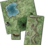
These babies are often pretty good looking (have you seen the beautiful Icewind Dale or Wilderness Tiles?), usually hitting the themes you’re looking for – wilderness of all kinds, constructed dungeon rooms of all types, city streets, etc. I love the modular Lego-like capabilities of D&D Dungeon Tiles too. Still, they take the most time out of all these solutions to both gather and set up for actual game play, and their space requirement – both in portability and table space – can be sometimes be unwieldy for larger dungeons and encounter areas.
Some sort of mat or cloth underneath or the puzzle-piece interlocking innovation in the D&D board games series helps with another minor drawback: keeping those tiles still! Oh, and there’s a matter of storage here too – Dungeon Tiles add up if you love them. And despite the minor annoyances, trust me, they’re hard not to love!
Poster Maps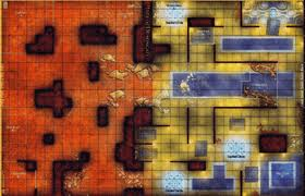
If Dungeon Tiles are pretty good looking, then a lot of poster maps are gorgeous. Also called “battlegrids” thanks to the D&D Miniatures skirmish game, they’re found more often in various slightly older D&D and D&D Miniatures accessories like the Fantastic Locations series, or occasionally in newer releases (i.e. adventures).
On top of good looks, I love poster maps for their speed and ease of use – look for the right theme (or something close) for your dungeon or encounter area, and boom, down it goes. No muss, no fuss. You can’t change it as much as tiles, but what you can do is fold it for smaller encounter areas.
And you can always season parts of a poster map with tiles on top for a nice combined tiles-poster map solution, which I am occasionally fond of doing – if I have the time and can find all the tile pieces that are just the right flavor!
Short on prep time? Poster maps. All the way. By a lot.
Erasable Battlemats
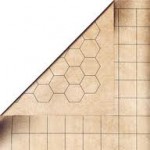
Just picked up my own Chessex erasable battlemat after seeing a friend of mine use one in his games. I like the versatility one brings, even though you lose something in the artistic or graphical presentation that dungeon tiles or poster maps provide.
Drawing time is typically low, and you can often sketch during and get away with it, or sketch ahead of time so you don’t have to worry about having to change or erase much, at least not until you move onto a new encounter area after the first.
You do have to break out or pack a little extra gear with you in the form of the right markers (and multi-color is always nice as you draw) so you don’t leave permanent stains. Speaking of which, it could get messy if you’re not careful, too. You may or may not care about staining your books, sheets, or clothes, but it’s something that could happen.
Once again, you can go with a blended solution here and use Dungeon Tiles on top of the battlemat, or even combine and overlap the mat with poster maps to create huge areas.
Workarounds
Want to avoid building entire dungeon complexes and pack all maps, mats or tiles for them? Well, keeping in line with 4e’s encounters being longer “set-piece” types of important events all the time, you can focus only on having the maps ready for those particular encounter areas and rooms. You could essentially handwave or fast forward through the connecting bits. It matches up well enough with one of 4e’s themes: get to the fun. Or more accurately, the most fun parts of the game.
Careful though, not everyone finds it fun skipping these things. Some players and DMs enjoy exploration more than others – and exploration is also a key theme 4e talks about as a core part of the D&D experience. Sure, tediously checking every 5’ square for death traps is bad. But so is skipping every 5’ square, every time, as if exploration doesn’t matter.
Talk about this key exploration and mapping point with your playgroup and experiment to help find the right balance for your particular encounters, adventures and campaigns.
 Improvement Ideas
I had a welcome flash of inspiration the other day when wishing I could execute Dungeon Tile mapping in-game better: Post-Its! Numbered Post-Its underneath the side of the Dungeon Tiles that are likely to come up next session, keying them to my adventure notes’ rooms as the dungeon unfolds.
This numbered key should make the use of Dungeon Tiles in-game more organized, even though the prep time issue remains high. This may even add to it, which I’m not too keen on.
Still, the look, feel and modularity of Dungeon Tile encounter areas is attractive, so I really want to see if organizing my tiles this way works well.
I also want to try the erasable battle mat too, but first… my quest for efficient Dungeon Tile mapping continues!
Are Your Maps Awesome?
What time-saving and hassle-minimizing tips and tricks do you have for encounter area maps in your D&D games? What other types of affordable maps do you use? What works, and what really works? And what doesn’t? Who wins the Mapping Options Deathmatch? Declare your winner and share a few of your best mapping secrets here.
We have a couple of methods (foamboard, Hirst Arts blocks, and Fat Dragon). I simply can’t get enough of 3d Terrain.
We have some good pics here http://stuffershack.com/xtras/3d-battle-maps/
Check them out!
Wow, those are awesome! The Village of Dusk is absolutely stunning! I love the huge-elevation elements that the Tower of Power and Shrine give you, incredible. Some of the best fights are ones with multiple elevations – ledges, balconies, spiral stairways, etc. The Horned Hold pics are really cool too. You made all that? Amazing haha… yeahhh, I need to watch your video now, thanks Tourq for the inspiration.
And thanks for the reminder about Fat Dragon Games cool 3D terrain and maps over at RPGNow.com. I had seen their newer Dragonshire Watermill a few weeks ago and found it both impressive and pretty affordable.
Sadly, I have different feelings about the Village of Dusk, as my character drowned in that fight.
Oh no! Haha… such is the life of adventurers, full of glory and treasure but also plenty of risk and the ocassional painful, horrible death 😉